William Morris Colours Explained: How to Decorate With Rich, Historic Palettes and Willy Morris Home Emporium
If there’s one design legacy that continues to captivate interior lovers, it's the timeless beauty of William Morris colours. Rooted in the Arts and Crafts Movement of the late 19th century, Morris’s palette embraces warmth, depth and harmony - reflecting nature, history and artisan craft. At Willy Morris Home Emporium, we celebrate these rich, historic hues and help you incorporate them into modern spaces with confidence and creativity.
In this deep dive, I’ll explore:
- The significance of William Morris’s colour philosophy
- The core hues and palettes that define William Morris style
- How to decorate with historic colours in contemporary homes
- Practical room-by-room decorating ideas
- Tips for pairing William Morris colours with furniture, textiles and finishes
- How Willy Morris Home Emporium helps you bring these palettes to life
Let’s get started.
1. The Legacy of William Morris Colours
William Morris didn’t just design fabrics, wallpapers and textiles - he developed a colour language. Inspired by nature, medieval art and medieval craftsmanship, his palette stands apart from fleeting trends. Morris believed that colours should feel alive and connected to the natural world: dusky greens like fern and olive, warm ochres and rusts, deep blues and wine reds.
Rather than bright, synthetic hues, Morris championed:
- Earthy tones
- Subtle contrasts
- Nature-inspired saturation
- Matte finishes with depth and texture
These choices weren’t accidental. Morris understood that colour impacts mood, perception of space and human emotions - key principles for anyone working with interior design.
At Willy Morris Home Emporium, I honour this philosophy by curating products grounded in William Morris’s heritage colour palette - in all my home décor items.
2. Understanding the William Morris Colour Palette
To decorate with William Morris colours, it’s essential to understand the palette’s rhythm and balance. Morris didn’t use isolated colours; he layered them, often combining several hues in a composition to form depth and unity.
🔹 Key Characteristics:
- Natural Inspiration: Colours reminiscent of gardens, woods, and landscapes.
- Muted Intensity: Colours are rich, not loud - they age gracefully.
- Harmonious Combinations: Each shade is created to work with others in the Morris canon.
Here are some classic William Morris colour types you’ll see throughout Willy Morris Home Emporium collections:
Forest Greens
Greens form the backbone of many Morris designs. Think of fern, sage, olive and deep moss - these colours evoke the British countryside and offer a calming effect in interiors.
Warm Neutrals
Morris’s warm neutrals include sandstone, taupe, muted gold and warm greys. These act as grounding colours that pair beautifully with deeper tones.
Rich Reds & Burgundies
From brick red to wine, these colours bring warmth and historical resonance - perfect for creating a cozy, inviting ambiance.
Deep Blues
Morris wasn’t afraid of blues - but they’re always deep and thoughtful: navy, ink blue, petrol - these colours anchor spaces with elegance.
Earthy Yellows & Golds
Muting bright yellows into ochre, mustard or antique gold evokes vintage charm and warmth.
Soft Floral Pinks & Purples
Found in many William Morris floral patterns, these muted hues add gentle feminine touches without being sweet or saccharine.
By learning these groups, you’ll begin to see the colour logic in every Morris pattern and feel confident combining them in your own home.
3. Decorating With William Morris Colours
Decorating with William Morris Colours isn’t about copying historic interiors - it’s about interpreting a timeless palette in a way that fits modern life. The aim is to create spaces that feel warm, historic, layered and intentional.
Here are practical ways to use these rich palettes throughout your home.
A. Living Room: A Lounge Full of Depth and Conversation
The living room - where guests gather, evenings unwind and first impressions are made.
To harness William Morris colours here:
Walls & Large Surfaces
- Choose a muted green or warm neutral - sage, fern or taupe - as a base. These colours invite comfort without feeling heavy.
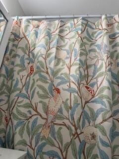
- If you love wallpaper, opt for classic William Morris prints like Strawberry Thief or Willow Bough in deeper colourways. These anchor the space with pattern and historic charm.
Furniture & Upholstery
- Pair deep seat sofas in ink blue or brick red with cushions in contrasting Morris florals.
- Wooden furniture in dark oak or walnut resonates with the earthy palette.
Textiles
- Layer in textured throws and velvet cushions in ochre or wine to make the room feel lived-in and layered.
- Use curtains in coordinating colours to frame windows, creating an enveloping, cohesive look.
Design Tip: Let wallpaper serve as the star - then pull accent colours from the pattern into soft furnishings and décor.
B. Bedroom: A Sanctuary of Historic Hues
Bedrooms benefit from calmer, more restful palettes - but that doesn’t mean bland.
Walls
- Soft neutrals like warm grey or light taupe create a soothing backdrop.
- For a feature wall behind the bed, choose a William Morris floral wallpaper in rich but calm shades such as muted pinks, greens or blues.
Bedding & Textiles
- Layer with quilts in deep burgundy, forest green or ink blue for contrast.
- Linen or cotton sheets in neutral tones balance the darker components.
Accessories
- Lamps with ceramic bases in earthy greens or blues.
- Rugs with subtle Morris motifs bring a touch of historic artistry underfoot.
Design tip: In bedrooms, combine restful tones with a single accent - like burgundy or wine - for warmth without distraction.
C. Kitchen & Dining: Savouring Colour Every Day
Applying William Morris colours to kitchens brings warmth and appetite-boosting energy.
Cabinets & Millwork
- Deep hues such as fern green or ink blue on lower cabinetry offer solidity and style.
- Upper cabinets in light neutrals keep the space from feeling too enclosed.
Tiles, Backsplashes & Walls
- Terra-cotta or muted yellow tiles pair beautifully with darker cabinetry.
- Consider a Morris floral wallpaper on a single kitchen wall or breakfast nook.
Dining Room
- A rich ochre or warm mustard wall colour animates formal dining settings.
- Drapery in William Morris patterns softens acoustics and adds historic depth.
Design tip: In kitchen zones, balance darker, saturated colours with lighter accents to keep the space lively and cheerful.
D. Hallways & Entryways: First Impressions With Character
These transitional spaces are ideal for bold experimentation.
- Darker William Morris wallpapers - like 'Blackthorn' or 'Acanthus' - in hallways create a cozy, enveloping welcome.
- Add a runner rug with subtle patterns in earth tones to elongate the space.
Design Tip: Hallways are narrow by nature - use deeper colours to make them feel snug, then brighten with brass or bronze hardware.
4. How to Pair William Morris Colours With Modern Elements
A common question I hear at Willy Morris Home Emporium is: "How do I keep things from feeling old-fashioned?"
The answer lies in balance - pairing historic palettes with contemporary elements.
A. Metals & Hardware
- Brass and aged gold hardware adds warmth and complements rich reds or yellows.
- Black iron or matte black works beautifully with deep greens and blues, creating a modern contrast.
- Polished chrome can also work - just balance it with organic textures elsewhere.
B. Furniture Styles
Don’t feel limited to antique furniture. Pair William Morris colour schemes with:
- Mid-century modern chairs in walnut
- Clean-lined sofas in contemporary silhouettes
- Minimalist tables in natural wood
This mix honours tradition without reverting to a museum aesthetic.
C. Textures
Textures play a huge role in how colours read. Consider:
- Velvet in deep forest green or burgundy for luxury
- Linen in neutral tones for relaxation
- Woven baskets and natural fibres to ground spaces
Layering texture keeps historic palettes feeling fresh and relevant.
5. Analysing Key William Morris Hues and What They Mean
Let’s look deeper at a few iconic Morris colours and their decorating effect:
Fern Green 🌿
- Meaning: Calm, grounded, organic
- Use: Living rooms, studies, bedrooms
- Pair with: Ochre, warm neutrals, dark wood
A quintessential Morris colour - deeply rooted in nature. Fern green creates serenity while carrying visual complexity.
Brick Red 🔥
- Meaning: Warmth, hospitality, heritage
- Use: Dining rooms, cozy corners
- Pair with: Soft neutrals, forest green, ochre
Brick red brings warmth without overpowering the senses - ideal for spaces where people linger.
Ink Blue 💙
- Meaning: Depth, focus, sophistication
- Use: Libraries, living rooms, bedrooms
- Pair with: Warm wood tones, cream, brass
Ink blue offers a timeless elegance across rooms. It can be bold but beautifully balanced.
Ochre / Muted Yellow 🌞
- Meaning: Cheer, richness, optimism
- Use: Kitchens, dining areas, hallways
- Pair with: Greens, warm neutrals, reds
Morris’s yellows aren’t bright; they’re earthy and sophisticated - perfect for enlivening everyday spaces.
6. Practical Decorating Checklist with William Morris Colours
To help you translate theory into action, here’s a practical step-by-step checklist:
Start With a Base Colour
Choose a base from neutral Morris tones - e.g., warm taupe or soft green - for walls or large furniture.
🎨 Add 2–3 Accent Hues
Balance depth and brightness. For example:
- Fern green + ochre + brick red
- Ink blue + warm grey + muted pink
🛋 Incorporate Pattern
William Morris wallpapers, textiles or rugs bring context to your palette.
🕯 Balance With Texture
Velvets, woods, linens and ceramics help the colours 'feel lived-in'.
💡 Use Finishes Strategically
Match metals and finishes to colours:
-
* Brass with reds and greens
* Black iron with blues
* Wood tones that resonate with earthy hues
7. Willy Morris Home Emporium: Your Source for Historic Colour Inspiration
At Willy Morris Home Emporium, I believe that beautiful homes start with inspired colour palettes. Our curated collections draw directly from William Morris’s legacy - with products that celebrate artisan quality and historic colour sensibilities.
Our Featured Collections Include:
- William Morris & Co. wallpapers in classic colourways
- Textiles and upholstery fabrics in historic palettes
- Cushions and throws that echo iconic Morris motifs
- Rugs and runners in heritage hues
Each product begins with colour - because colour is the first emotion your home expresses.
8. Styling Tips From the Studio
Here are a few insider tips we share with clients:
Think in Layers
Start with a dominant colour, then add mediums and accents. For instance:
1. Base: Warm neutral walls
2. Medium: Fern green sofa
3. Accent: Ochre cushions + floral Morris wallpaper
This layering mirrors nature’s complexity - which is precisely what William Morris celebrated.
Don’t Fear Dark Colours
Deep hues aren’t overwhelming when balanced with light surfaces and reflective materials (like brass or glass).
Use Rugs to Tie It All Together
A patterned rug with multiple Morris hues instantly unifies furniture and wall colours.
9. Colour Mistakes to Avoid
Even beautiful palettes can fall flat without thoughtful execution. Here’s what to watch out for:
❌ Too Many Bold Colours at Once
Stick to 2–3 dominant hues.
❌ Ignoring Natural Light
Dark Morris colours feel richer with plenty of light - plan accordingly.
❌ Mismatched Finishes
A glossy finish can make historic colours feel inauthentic - choose matte or soft sheens.
10. Final Thoughts: Why William Morris Colours Still Matter
Over a century after his designs first emerged, William Morris Colours still resonate - and that’s no accident. They’re rooted in nature, human emotion and the belief that beauty belongs in everyday life. Decorating with these palettes doesn’t mean copying a museum - it means creating spaces that feel layered, soulful and connected to history.
At Willy Morris Home Emporium, every product and colour choice is a nod to that legacy. Whether you’re renovating a whole room or adding a few accents, let historic palettes inspire your next design chapter.